Quantcast
Channel: DesignDaily
Viewing all 796 articles
Browse latest View live

Tang Palace by FCJZ

$
0
0


Beijing-based Atelier FCJZ designed the Tang Palace restaurant in Hangzhou, China.


Tang Palace by FCJZ

The restaurant is located on the top floor of a superstore in the new town area of Hangzhou, with 9-meter high story height and a broad view to the south. Composite bamboo boards are selected as the main material, conveying the design theme of combining tradition and modernity.

In the hall, to take advantage of the story height, some of the private rooms are suspended from the roof and creating an interactive atmosphere between the upper and lower levels, thus enriching the visual enjoyments. The original building condition has a core column and several semi-oval blocks which essentially disorganized the space. Hence, our design wants to reshape the space with a large hollowed-out ceiling which is made from interweaved thin bamboo boards; and extending from the wall to the ceiling. The waved ceiling creates a dramatic visual expression within the hall. The hollowed-out bamboo net maintains the original story height and thereby creates an interactive relation between the levels. We also wrapped the core column with light-transmitting bamboo boards to form a light-box, which transforms the previously heavy concrete block into a light and lively focus object.

The entrance hall also follows the theme of bamboo. The wall is covered with bamboo material which follows the original outline of the wall, turning it into a wavy surface. In this way, the surface echoes the hall ceiling as well as performs a guiding function for customers.

The design of private rooms embraces different characteristics. The rooms on the first level are relatively bigger and share the features of expanded bamboo net from the wall to ceiling and ornamentally engraved wall surfaces. Meanwhile, the different folding angles and engraved patterns make each room different from one another. The rooms above on the south are smaller and feature a special waved ceiling pattern and simple bamboo wall surface, which creates interesting and spacious room features. The key design concept of the space is that the suspended rooms are connected with suspended bridges and sideway aisles. The semi-transparent wall provides a subtle relationship between the inner and outer spaces, bestowing people with a special spatial experience.

In this design, we hope to create diversified and yet an interrelated interior spaces through the different usages of the new bamboo material, responding to the local culture while seeking intriguing spatial effects.

Project: Tang Palace, Hangzhou, China
Location: 6th Floor of MixC, No. 701, Fuchun Road, Jianggan District, Hangzhou, China
Client: HongKong Tang Palace Food&Beverage Group Co., LTD.
Area: 2460 ?
Materials: Bamboo, Composite Panel, Rubbed Concrete
Designer: Atelier Feichang Jianzhu
Principal Designer: Chang Yung Ho
Project Architect: Lin Yihsuan
Design Team: Yu Yue, Wu Xia, Suiming Wang
Construction Period: February 2010–July 2010
General Contractor: Shenzhen C.S.C. Decoration Design Engineering CO., LTD Beijing Branch
Finish material: Wall__bamboo(1f), marble(2f)/ Flooring__terrazzo(1f), carpet(2f) / Ceiling __bamboo net(1f), painting(2f)
Photographer: Shu He

Source : Contemporist

Hongzhu Housing Sales Center / Lab Modus

$
0
0

The site is a long rectangular shape with the narrower side facing a street by the Taoyuan County exit of national highway.
The scheme consists of a two-story lifted glass box and a sequence of double layered perforated metal panels. Resonating with the form of ancient Chinese lucky animal, the form of the project takes inspiration of “dragon”, a symbol of success and luck. Giving maximum presence to the context, the overall massing of project applies advantage of the length of the site to make a continuous extension to all dimensions of the project.
In addition, the gradually transformed perforated metal panels also provide an eco-friendly solution to prevent direct sunlight exposure into the interior space to reduce the usage of air condition and artificial lighting devices.


Source : Archdaily

Forest Net, Japan

$
0
0

Structural design: Norihide Imagawa, T.I.S. & Partners, Tokyo, Japan
Project design: Takaharu & Yui Tezuka , Tezuka Architects, Tokyo, Japan
Photos: Masaki Koizumi


Transformer apartment / Vlad Mishin

$
0
0


A convertible 60sqm apartment divided lengthwise by a multi-functional plywood structure, designed by Russian architect Vlad Mishin.

“Main part of transforming blocks creates space of a common room. It is three rotating blocks, main one has tv-panel. Block rotates on its axis and it makes possible to look tv from different places- bedroom, kitchen and common room. Two other blocks are folding and auxiliary, they also serve as door opening to bedroom.”

SKY GARDEN HOUSE (Meera House)

$
0
0

Sky Garden House is designed with a central void and largely shallow volumes, particularly on the upper floors, which maximizes cross ventilation and reduces dependence on mechanical air conditioning.

The large shaded areas of glazing on most rooms reduce the reliance on artificial lighting during day light hours while minimizing solar gain and the large acrylic window in the basement level media room floods it with diffused natural light, further reducing energy consumption. The gardens on each level typically overhang the storey below, providing shade and reducing overheating in Singapore’s tropical climate.

The concept of Sky Garden House is strongly influenced by the ambition of enhancing the occupant’s quality of life. This is largely achieved by the roof gardens on every level. As well as having direct access to these, interior spaces have large areas of glazing with views out over the gardens to the sea and sky. The large amount of natural day light brought in contributes strongly to a good indoor environment. Large acrylic windows in the pool result in even the basement receiving great amounts of diffused natural light.

The design of the open air stairwell cutting through the centre of the building reduces the depth of indoor areas and encourages cross ventilation. Using the natural cross ventilation to its potential, along with the assistance of mechanical ventilation when necessary, produces a high indoor air quality important to the wellness of inhabitants.

The integration of ‘Sky Garden House’ with nature and the outdoors is most evident in the garden areas on every level. The gardens, with much planting and a number of trees, reduce carbon dioxide and help counter green house gas emissions. The large areas of grass absorb much less heat than conventional roofing materials resulting in less thermal storage in the building itself, reducing the required use of cooling systems.

In the tropical climate of Singapore, with the heavy rains, water retention of garden areas will also contribute to reducing the pressure on the surface water system at peak times.


Source : Archello

Graffiti mural on Megaro Hotel by Agents of Change

$
0
0
  
The Megaro project a graffiti mural painted on the classical facade of Megaro Hotel opposite St Pancras station, London, 2012. 
The mural was designed and painted by four members of street art collective, Agents of Change.


Curved Cliff House: Metal & Glass Bend in Waterfront Breeze

$
0
0


Its exterior shape is more than just an affection, though at first glance it almost looks to have been formed by natural elements – waterfront 

However, these contortions translate into a series of spaces where convex and concave moments of glass inform remarkable views back out of this Lake Tahoe retreat by Mark Dziewulski Architect.

A stunning tapered oval glass staircase wraps up a central tower, dynamically depositing residence on different floors facing different ways back out onto the natural landscape.

Strategic overhangs in individual spaces provide daunting experiences in places like the bedroom, but a corresponding feeling of connection with the outdoors (as well as shade from the high and hot summer sun).


Source: dornob

Toyo Ito wins Pritzker Prize 2013

$
0
0


News: Japanese architect Toyo Ito has been named as the 2013 laureate of the Pritzker Architecture Prize.

Toyo Ito, based in Tokyo, has previously been awarded the RIBA Gold Medal in 2006 and the Praemium Imperiale by the Japan Art Association in 2010, and his Japanese Pavilion was awarded best pavilion at last year's Venice Architecture Biennale.

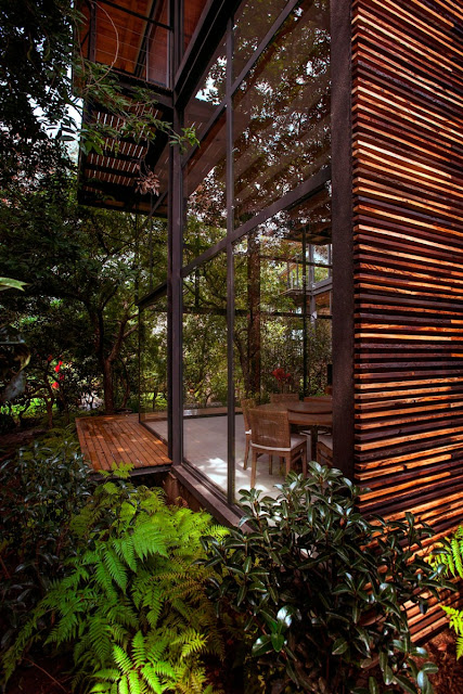
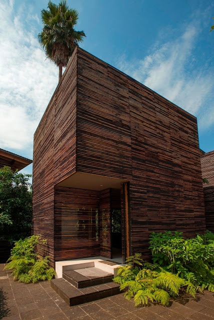
His works include the TOD’S Omotesando Building in Tokyo, Sendai Mediatheque, Tama Art University Library in Tokyo and Za-Koenji Public Theatre in Tokyo.

He is the sixth Japanese architect to receive the award, following Kenzo Tange in 1987, Fumihiko Maki in 1993, Tadao Ando in 1995, and Kazuyo Sejima and Ryue Nishizawa in 2010.


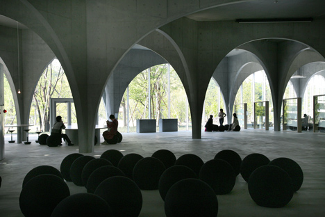
Above: Sendai Mediatheque, 1995—2000, Sendai-shi, Miyagi, Japan. Photo by Tomio Ohashi.

“Architecture is bound by various social constraints," Ito said. "I have been designing architecture bearing in mind that it would be possible to realise more comfortable spaces if we are freed from all the restrictions even for a little bit. However, when one building is completed, I become painfully aware of my own inadequacy, and it turns into energy to challenge the next project. Probably this process must keep repeating itself in the future. Therefore, I will never fix my architectural style and never be satisfied with my works.”

The Pritzker Prize is presented annually to a living architect in recognition of contributions to both humanity and the built environment through architecture. Ito will receive a $100,000 prize and be presented with a bronze medallion in a ceremony on 29 May in Boston at the John F. Kennedy Library designed by I.M. Pei, the 1983 Pritzker Laureate.

Recent recipients of the award include Wang Shu, Eduardo Souto de Moura and SANAA. See more about the Pritzker Prize on Dezeen.


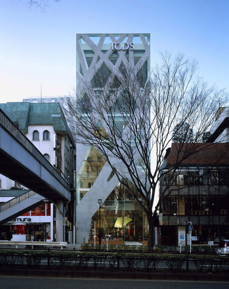
Above: TOD’S Omotesando Building, 2002—2004, Shibuya-ku, Tokyo, Japan. Photo by Nacasa & Partners Inc.

Here's the announcement from the organisers:

Toyo Ito of Japan is the 2013 Pritzker Architecture Prize Laureate

Toyo Ito, a 71 year old architect whose architectural practice is based in Tokyo, Japan, will be the recipient of the 2013 Pritzker Architecture Prize, it was announced today by Thomas J. Pritzker, chairman of The Hyatt Foundation which sponsors the prize. Ito is the sixth Japanese architect to become a Pritzker Laureate -- the first five being the late Kenzo Tange in 1987, Fumihiko Maki in 1993, Tadao Ando in 1995, and the team of Kazuyo Sejima and Ryue Nishizawa in 2010.

The formal ceremony for what has come to be known throughout the world as architecture’s highest honor will be at the John F. Kennedy Presidential Library and Museum in Boston, Massachusetts on Wednesday, May 29. This marks the first time the ceremony has been held in Boston, and the location has particular significance since it was designed by another Pritzker Laureate, Ieoh Ming Pei who received the prize in 1983.

In making the announcement, Pritzker elaborated, “We are particularly pleased to be holding our ceremony at the Kennedy Library, and it is even more significant because the date is John F. Kennedy’s birthday.”

The purpose of the Pritzker Architecture Prize, which was founded in 1979 by the late Jay A. Pritzker and his wife, Cindy, is to honor annually a living architect whose built work demonstrates a combination of those qualities of talent, vision and commitment, which has produced consistent and significant contributions to humanity and the built environment through the art of architecture. The laureates receive a $100,000 grant and a bronze medallion.

Pritzker Prize jury chairman, The Lord Palumbo, spoke from his home in the United Kingdom, quoting from the jury citation that focuses on the reasons for this year’s choice: “Throughout his career, Toyo Ito has been able to produce a body of work that combines conceptual innovation with superbly executed buildings. Creating outstanding architecture for more than 40 years, he has successfully undertaken libraries, houses, parks, theaters, shops, office buildings and pavilions, each time seeking to extend the possibilities of architecture. A professional of unique talent, he is dedicated to the process of discovery that comes from seeing the opportunities that lie in each commission and each site.”


Above: Tama Art University Library (Hachiōji campus), 2004—2007, Hachioji-shi, Tokyo, Japan. Photo by Tomio Ohashi.

Toyo Ito began working in the firm of Kiyonori Kikutake & Associates after he graduated from Tokyo University’s Department of Architecture in 1965. In1971, he founded his own studio in Tokyo, and named it Urban Robot (Urbot). In 1979, he changed the name to Toyo Ito & Associates, Architects.

He has received numerous international awards, including in 2010, the 22nd Praemium Imperiale in Honor of Prince Takamatsu; and in 2006, The Royal Institute of British Architects’ Royal Gold Medal; and in 2002, the Golden Lion for Lifetime Achievement for the 8th Venice Biennale International Exhibition. Calling him a “creator of timeless buildings,” the Pritzker Jury cites Ito for “infusing his designs with a spiritual dimension and for the poetics that transcend all his works.”

Toyo Ito made this comment in reaction to winning the prize: “Architecture is bound by various social constraints. I have been designing architecture bearing in mind that it would be possible to realize more comfortable spaces if we are freed from all the restrictions even for a little bit. However, when one building is completed, I become painfully aware of my own inadequacy, and it turns into energy to challenge the next project. Probably this process must keep repeating itself in the future. “Therefore, I will never fix my architectural style and never be satisfied with my works,” he concluded.

One of his first projects in 1971 was a home in a suburb of Tokyo. Called “Aluminum House,” the structure consisted of wooden frame completely covered in aluminum. Most of his early works were residences. In 1976, he produced a home for his sister, who had recently lost her husband. The house was called “White U” and generated a great deal of interest in Ito’s works. Of most of his work in the 1980’s, Ito explains that he was seeking to erase conventional meaning from his works through minimalist tactics, developing lightness in architecture that resembles air and wind.

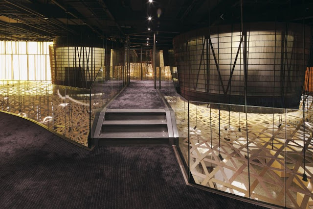
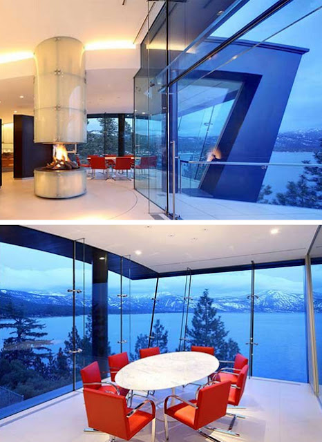
He calls the Sendai Mediatheque, completed in 2001 in Sendai City, Miyagi, Japan, one of the high points of his career. In the Phaidon book, Toyo Ito, he explains, “The Mediatheque differs from conventional public buildings in many ways. While the building principally functions as a library and art gallery, the administration has actively worked to relax divisions between diverse programmes, removing fixed barriers between various media to progressively evoke an image of how cultural facilities should be from now on.”


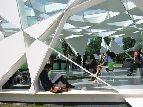
Above: Serpentine Gallery Pavilion, 2002, London, UK.

The jury commented on this project in their citation, saying, “Ito has said that he strives for architecture that is fluid and not confined by what he considers to be the limitations of modern architecture. In the Sendai Mediatheque he achieved this by structural tubes, which permitted new interior spatial qualities.”

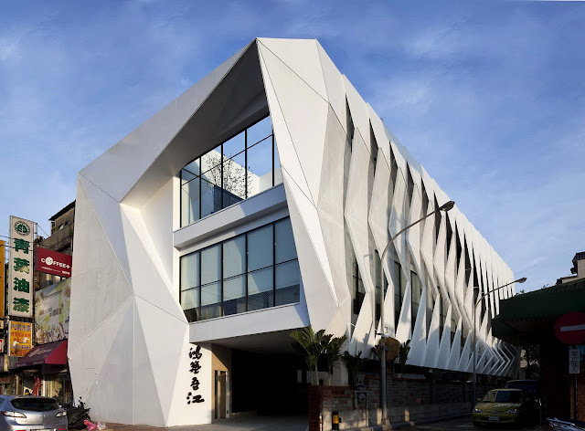
Another of Ito’s projects commented on by the jury is the TOD’S Omotesando building in Tokyo, “where the building skin also serves as structure,” to quote the jury citation, and further, “Innovative is a word often used to describe Toyo Ito’s works.” Citing the Municipal Funeral Hall in Gifu Prefecture, Tokyo’s Tama Art University Library, and London’s 2002 Serpentine Gallery Pavilion, the jury calls attention to some “of his many inspiring spaces.”

The distinguished jury that selected the 2013 Pritzker Laureate consists of its chairman, The Lord Palumbo, internationally known architectural patron of London, chairman of the trustees, Serpentine Gallery, former chairman of the Arts Council of Great Britain, former chairman of the Tate Gallery Foundation, and former trustee of the Mies van der Rohe Archive at The Museum of Modern Art, New York; and alphabetically: Alejandro Aravena, architect and executive director of Elemental in Santiago, Chile; Stephen Breyer, U.S. Supreme Court Justice, Washington, D.C.; Yung Ho Chang, architect and educator, Beijing, The People’s Republic of China; Glenn Murcutt, architect and 2002 Pritzker Laureate of Sydney, Australia; and Juhani Pallasmaa, architect, professor and author of Helsinki, Finland. Martha Thorne, associate dean for external relations, IE School of Architecture & Design, Madrid, Spain, is the executive director of the prize.


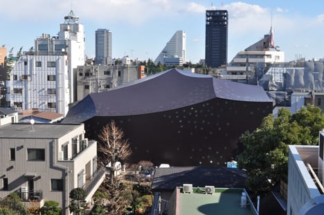
Above: Za-Koenji Public Theatre, 2005—2008, Suginami-ku, Tokyo, Japan.

In addition to the previous laureates already mentioned, the late Philip Johnson was the first Pritzker Laureate in 1979. The late Luis Barragán of Mexico was named in 1980. The late James Stirling of the United Kingdom was elected in 1981, Kevin Roche in 1982, Ieoh Ming Pei in 1983, and Richard Meier in 1984. Hans Hollein of Austria was the 1985 Laureate. Gottfried Böhm of Germany received the prize in 1986. Robert Venturi received the honor in 1991, and Alvaro Siza of Portugal in 1992. Christian de Portzamparc of France was elected Pritzker Laureate in 1994. Frank Gehry of the United States was the recipient in 1989, the late Aldo Rossi of Italy in 1990. In 1996, Rafael Moneo of Spain was the Laureate; in 1997 the late Sverre Fehn of Norway; in 1998 Renzo Piano of Italy, in 1999 Sir Norman Foster of the UK, and in 2000, Rem Koolhaas of the Netherlands. Australian Glenn Murcutt received the prize in 2002. The late Jørn Utzon of Denmark was honored in 2003; Zaha Hadid of the UK in 2004; and Thom Mayne of the United States in 2005. Paulo Mendes da Rocha of Brazil was the Laureate in 2006, and Richard Rogers received the prize in 2007. Jean Nouvel of France was the Laureate in 2008. In 2009, Peter Zumthor of Switzerland received the award. In 2010, two Japanese architects were honored, partners Kazuyo Sejima and Ryue Nishizawa of SANAA, Inc. In 2011, Eduardo Souto de Moura of Portugal was the laureate. Last year, Wang Shu of The People’s Republic of China became the laureate.

The field of architecture was chosen by the Pritzker family because of their keen interest in building due to their involvement with developing the Hyatt Hotels around the world; and because architecture was a creative endeavor not included in the Nobel Prizes. The procedures were modeled after the Nobels, with the final selection being made by the international jury with all deliberations and voting in secret. Nominations are continuous from year to year with hundreds of nominees from countries all around the world being considered each year.

Chipicas Town Houses by Alejandro Sanchez Garcia Arquitectos

$
0
0

Alejandro Sanchez Garcia Arquitectos created this 2009 project built within the confines of a private garden in Valle de Bravo, México. It consists of a series of four houses each with three floors and a wooden lattice skin for for privacy.


Chipicas Town Houses by Alejandro Sanchez Garcia Arquitectos:
“These four houses are built inside a private garden in downtown Valle de Bravo.The vertical design was used to salvage most of the vegetation, as well as, a solution to the small footprint.

Each house is a three-story house plus a roof garden; displaying two sides of the façade with floor to ceiling windows and two sides with a skin made of wooden lattice to gain a sense of privacy.”

Collider Activity Center International Competition

$
0
0


Architect , Marin Keremidski has sent us her project for Collider Activity Center International Competition (a place that gathers all active people and offers unlimited combinations of sports, rest and networking) and it was ranked as one of the TOP10 projects.


1.Introduction. Concept. Goals.


The current project for Collider Activity Center aims not only to construct a building with materials appropriate for active sport, but also to bring a piece of nature into the urban environment. It follows the idea to both create city space and influence human psychology. The goal of the project is to bring people back to nature. To provoke them. To make them curious and passionate about something new in town. “New” as a concept and a way of life. The project aims at visual and spiritual harmony that makes people associate themselves to a place they actually belong to. Collider Activity Center aims to become not just the next fashionable place in the capital, but to be perceived as an oasis in the physical and spiritual sense of the word. Addiction to a piece of land in Sofia. 
The concept of Collider Activity Center is attractive and speaks for itself. What this project adds to the general picture is that it can actually addict large number of people, successful, active, or just citizens of Sofia, to a building with no defined walls and a rooftop they can walk on – a place they can be themselves and truly feel comfortable by discovering various types of leisure activities, by relaxing, networking, practicing sports or simply enjoying the location. 


2.Location. 

The Collider Activity Center plot has an excellent location and transport connections. The extension of Andrei Liapchev Blvd. to the north /presently under construction/ leads to Tsarigradsko Shose Blvd. which takes you directly to Sofia city centre for about 10-15 min. At the same time you can access Mladost District form two different places from Alexandar Malinov blvd. The plot itself will be reached from northwest and southeast from Zecho Gumuchev Str. There is a metro station in immediate vicinity to the plot, as well as two bus stations with bus lines leading to different parts of Sofia. Pedestrians will get access from Zecho Gumuchev Str. at two spots – through the main entrance near the street and though a ramp directly into the restaurant. The staff parking lot /together with the staff entrance/ is positioned to the north in order to make use of the unfavorable exposure. The visitors’ parking lot is located out of the construction line in order to make use of the space. There are two access points at approximately equal distance. On the other side of Zecho Gumuchev Str. there are residence buildings. Behind them Vitosha mountain can be seen. The building naturally goes into the terrain, there is no fixed limit, which allows a view both to the mountain and to the southeast. In clear days there will be a view to Stara Planina Mountain. Two future projects are planned in the area: northwest- tv studios, to the south – a commercial center. The location of the building aims to avoid restriction of the view to the city and the mountain by the two projects. The complex /a building and a park as a whole/ is organized along the length of the plot and is developed in two directions: to the bottom of the plot and with a façade southward. 
A natural extension of the building is an axis shaped as a canyon, providing space for climbing walls, winter gardens and other facilities. The Boulder park is located on both sides of the canyon, and at the end of the plot – Ropetopia and a beach volleyball playground. The canyon leads northeast to the events stage. Southeast near the restaurant is situated an outdoor swimming pool, followed by a fountain and children's facilities, followed by a deep swimming pool. There is also a route for rough terrain mountain biking and jogging. 


3.Architectural concept. 

The architectural concept is expressed not only in the construction of a building with an adjoining park, but in the creation of a symbiotic organic whole –a building, green areas, water areas, alleys: a piece of nature incorporated in the urban environment with no clear boundaries within the plot. The result is natural and harmonious blend of the different elements. Visitors will be able to pass "through" the building, over the building, along the building. This creates an environment close to nature – surprising, harmonious and diverse, without clear distinctions between the elements. There is always more to discover. 
The "walls" of the building turn harmoniously into alleys in the park and the canyon that is actually a winter garden with spots for climbing. Practically there are two main 
elements: "rock" solid part and a green part. The climbing process will not only be associated with climbing walls, but will be provoked by the terrain and the building itself. There is an option to climb the southern part of the building close to the restaurant, as well as “conquering” the green roof. 
The building, part of the complex, will reach 22.00m at its highest point. In view of recent changes in the Law of Spatial Development in Bulgaria cornice level will now be determined and measured by the current project for the plot /"Vertical planning"/. Thus the plot as designed in the project is the one to be considered, and not the existing plot, which is an option to design greater height. The present project takes into consideration the existing terrain which creates an option to further design a greater height. 


4.Architecture 

4.1.“Building”. 
- Elevation+ 0.00m 
The access to the building is organized from two places: for visitors and for staff. The visitors access the building through the main entrance through a lobby with an information centre, bathrooms and others. The lobby provides a visual air connection to the upper level with climbing halls, and to the lower level with the multifunctional hall, fitness, spa centre and others. It also connects to the administration part through a staff entrance. An elevator and stairs provide the access to both levels. The ground level and the lobby is a distribution spot for the building. Function schemes of the building and staff at the information centre will give more information for directions. There is air space above the multifunctional hall, 3.50m elevation, as well as above the fitness. Above both spaces there will be galleries with usable area. The gallery above the multifunctional hall will access directly the courtyard of the terrace next to the restaurant. 

- Elevation + 3.75m 
This is the main level of the building with climbing halls. It accesses directly the uplifted courtyard. The restaurant is located at the same level with direct access to the courtyard and the swimming pool. The café is a connection between the two climbing halls and also provides access to the winter garden into the canyon through a ramp. At particular points the café visually connects to the climbing hall. Climbing walls are also located between Funtopia and the restaurant. The briefing room and lockers space at Funtopia is shaped as a sculpture through climbing walls where people will be able to climb, and in summertime the windows may be opened and thus the process of climbing outside and inside will be joined. 
The climbing hall is organized as follows: 3.75m elevation – hall for high climbing walls. Through one of the climbing walls visitors will be able to reach the upper level to the Boulders hall. This climbing turns into a sequential process and becomes an adventure. Boulders with be further reached by elevators and stairs. 
Depending on the climbing walls requirements, all surfaces of the present projects can be changed in different directions. 
Crane premise – elevator platform serving the hall for high climbing walls and the boulders hall. 

- Elevation +12.80m 
The location of the Boulders hall, accessible through a climbing wall from the lower level and through two staircases and an elevator. At a particular part of the slab above the hall for high climbing walls there is air space with visual connection to it. This level ensures access to the rooftop through the same vertical communications. 

- Elevation 18.95m 
Roof terrace. Access by stairs and elevators built into the side of the building. While climbing the stairs from 12.80m elevation visitors pass above the hall for high climbing walls, very close to climbing people, so the process is visible. The rooftop is a green terrace offering the option of a picnic. The necessary service facilities are provided, together with a visual connection to the climbing halls through upper lighting. Handrails are hidden in the greenery. There is an option to “conquer the hill” in both directions of the green rooftop. 

- Elevation-3.15m 
Lobby, multifunctional hall, fitness, spa centre, service and technical premises and others, including the lower level of the administration block. The offices are designed as duplexes with regard to natural light coming in the premises from +-0.00m. through the air space above the lobby. The fitness and the multifunctional hall on the southern side also have natural lighting through displacement of the outer terrain. The building gets natural lighting through the façade system with double-curved glass and upper lighting. 

4.2.Courtyard. 
The courtyard is a natural continuation of the building, the construction, the concept and the geometrical shape. It is accessible both through internal space of the building and directly through the street. Through the building it is accessible from the restaurant and the common climbing spaces and from the café through a ramp. The courtyard is organized around the axis of the artificial canyon, which is a natural extension of the ramp from the cafeteria. The canyon is a concave space with climbing walls as retaining walls. Inside the canyon there are a café, a winter garden, and a space with an option to position temporary pavilions, kiosks, stands, that will not be calculated in the build-up area of the complex. The winter garden can be covered by tents. The canyon leads to an external events stage. The Boulder Park is located amongst greenery on both sides of the canyon. The building walls in the restaurant area can be used as climbing walls and naturally switch to a stone surface leading to the canyon. Nearby the restaurant there is an outdoor pool. The terrace at the same level leads to 
the gallery above the multifunctional hall where there are showers and lockers. The pool can be used by the people in the multifunctional building. There is a beach volleyball playground nearby the Boulder Park. The complex terrain of the park will challenge people to climb, to go to picnic and have fun.The floorings of the park is the following: green stone slabs in front of the building, stone flooring naturally merging with the building’s paneling, green areas with an option for vehicles to pass on them. Excavation and building works will be organized according to a relevant plan. 


5.Construction. Building materials. Construction Technology.
-Concrete and metal main structure. Walls: solid concrete, light concrete, brickwork, insulation. 
- For double surfaces / three dimensional / a scheme will be offered in order to reach the level of economy of standard solid construction. The scheme will include: 
- Unification of Certain radii in three dimensions; creation of a database of a number of repeating three-dimensional shapes that will reduce the cost by using three-dimensional formwork / thus full shuttering will be avoided: the same form will be used for a larger number of elements/. 
- phased use of formwork 
-staging in the various areas 
-build a ready three-dimensional elements in the factory that can be delivered and fitted on spot. This will allow the simultaneous work on the main construction and the walls. 
The roof of the building will be landscaped according to a pre-given architectural detail. The sloping area with inclination over 10-15 degrees will be landscaped with an enhancing system with frames, curved perforated elements or readymade square metal frames with diagonals in order to avoid landslip. There are number of companies offering different details /ZinCo Georaster; Cell-Tek Geosynthetics and others/ 

External cladding can be fulfilled in two ways: 

a/ through stone cladding with a large size of the slate /Slate Lite technology/. The material is flexible and can be curved. SLATE LITE consists of layers. It is 100% natural stone with thickness between 1 and 4mm and a base made of polyester with glass fiber for strength and stability. Possible sheets dimensions: 2700 x 1500mm and the gaps between the sheets can be almost invisible. The same material can be applied in the 

interior spaces. The material can be half-transparent and allow light inside. The cladding can be laid at long narrow strips 270/10-20cm. 

Advantages of the material: 

• Ecologically clean, treated natural stone; 
• Frost resistant to; 
• Easy fitiing, cutting and final processing; 
• Significantly reduces the weight of the building; 
• Reduces the cost of fittings and adhesives during application; 
• Stone cladding which, due to its flexibility, can be applied at corners, columns and other specific profiles; 
• Easy to transport, load and unload; 
• Large size of the plates; 
• Environmentally friendly; only 1 to 4 mm stone thickness; 
b/ facade painting by using a new painting system with "stone plaster". Better choice of texture and colours compared to Slate Lite. Stone plaster may create a visual effect of horizontal lining and a geological section of a rock and its layers. 

-Landscaping will be designed and fulfilled according to an architectural and landscaping project applying building indexes and required minimal area of 2/3 high greenеry. 


6. “Green energy” 

The following building efficiency measures are planned: 

-Roof planting 
-Watering system using rainwater drainage systems and through reservoirs in the area. 
-Wastewater system, reuse of wasterwater in toilets and water system

-A natural ventilation system through: 
a / canals / tunnels in the ground to create a natural flow to the spaces underground. The channels output will be at a shady place. For better performance, the canals will have a system of fans. 
b / system of holes / flaps in the walls, depending on the season and the flap to be opened will be create natural ventilation or isolation for turning the hot air. 
-Use of effective methods of heating, geothermal systems, heat pumps and more. 
-System for separate collection and recycling of waste and use it for additional revenue the site. 
System of mini-turbines to solve some needs for smaller loads, such as duty lighting, advertising lighting, etc.. 
-Lighting in the park with photovoltaic modules. 
-Using photovoltaic panels to heat the pool. 
Electronic centralized system for managing all energy-efficient systems. 
Possible LEED standard certification. 


7.Built-up area. 

Floor area – 1998sq.m. 
Area above ground level - 5715sq.m. Underground area – 2382sq.m. 
Total built-up area – 8097 
100 parking places


Levinson Plaza, Mission Park By: Mikyoung Kim Design

$
0
0

Envisioned as an urban grove, this central gathering space represents the convergence of community in this diverse, mixed income, residential development. The design accommodates a complex program, layering the varied multi-cultural and intergenerational uses with a number of meaningful gathering and recreational spaces for the residents. Tai Chi, chess, children’s play areas, and contemplative seating areas allow for various groups to utilize the garden spaces in different ways. Lawn areas can be used for sunbathing in the summer and also provide the community with areas for flexible programming during larger gatherings, such as celebrations for the Chinese New Year, Russian Unity Day, and other cultural and civic events.


Landscape Architect: Mikyoung Kim Design
Location: Boston, Massachusetts, USA
Project Year: 2008
Photographs: Courtesy of Mikyoung Kim Design


The plaza landscape design focuses on providing Mission Park with a landscape which draws its spirit from the regional gardens of New England. The plaza uses pavement materials which will endure the long, challenging winters, while the patterning itself is designed based on the herringbone patterns of residential landscapes. The plaza pattern stitches the areas of gathering and passage together while bringing a human scale to this large plaza space. The paved areas within the garden are carved out of the grove to allow for direct access to major entry points and public transportation.


The planting is composed of species that have been naturalized in the New England urban landscape. This palette of plants is able to withstand the demanding conditions a city provides; high winds, winter salt applications, poor soil conditions, and high ranges in air/soil temperature. Design considerations addressed the residents’ concerns with both visual and sound screening from Huntington Avenue, a congested main thoroughfare which accommodates the train and four lanes of vehicular traffic. Layered hedge rows consisting of River Birch and Zelkova filter these urban conditions while maintaining views for safety throughout the space.


The design for this 30,000 square foot project creates a comfortable outdoor environment. Previously defined by a central raised plaza, the space was exposed to the traffic and train congestion on nearby Huntington Avenue. The redesign of the site removes the grade changes to create a universally accessible landscape for the residents of this community, while utilizing a rich plant palette that allows for multiple types of programmatic activities to occur simultaneously in various garden rooms. The layering of the canopy trees, plant beds and paved surfaces reinforce the unity and democratic nature of the plaza.

Text provided by Mikyoung Kim Design.


ARCHITECTURAL CONCEPTION OF CULTURAL SPACE IN ANDRIYIVSKYY DESCENT IN KYIV

$
0
0

Mary Protsyk and Iryna Volynets have just sent us their entry project for the ARCHITECTURAL CONCEPTION OF CULTURAL SPACE IN ANDRIYIVSKYYDESCENT IN KYIV
that was ranked as the Second Place Project.


THE MAIN IDEA OF THE PROJECT 


The main idea of the project is to create cultural space on the territory of Andriyivskyy Descent in Kyiv. The Architectural conception of the space creation depends on historical values of Andriyivskyy Descent, its unique beauty and genuine spirit of the street. The proposed complex is situated on the former territory of the Yunist city block and on the territory of the factory of the same name. Whereas the descent is situated in the city center, the proposed space is a way to the Dnipro riverside. The main building is a landscape-building, which preserves historical surroundings and Zamkova hill silhouette. It becomes like an interaction of the building and landscape.

CITY PLANNING


The territory of Yunist city block is located within walking distance from city center and it also has a good developed transport network. There are three ways to the planned area: from Andriyivskyy descent, Frolivska street and Borychiv Tik street. The main curvilinear building starts from the pedestrian part of Frolivska street and goes through the whole territory and finishes at Andriyivskyy descent. The main curvilinear building is not only cultural space but also recreation space. The building with different functions are also located on this territory, namely café, restaurant and conference room. The open green amphitheatre is situated in the heart of the cultural space. The remainder territory is the pedestrian path and greenery plantations.


complex diagram


masterplan


dimensional diagram


ARCHITECTURAL IDEA

The cultural space, as a general function, connects all the buildings of the area. Furthermore, it accumulates a variety of functions: exhibition and exposition halls, place for relaxation and alternative studying, library halls, lounge zone and service room. Each building has an entrance to the street, green amphitheater and other buildings. The whole cultural space is like a labyrinth which combines different functions. Movement in building is provided by ramps, which give the possibility to move from one level to another. Moreover, the dynamic ramps also connect the buildings of the first level and the roof, which are separated from the exhibition zone by the glass walls. There is a pedestrian path on the roof which provides connectivity with the residential area neighboring street where one may find recreational zone with the places for sitting. The green islets, being the essence of the project, are grown along the path.


first floor plan

section1


section2


Gulating Museum Proposal By: LETH & GORI

$
0
0

The Gulating Museum proposal by LETH & GORI is a design for a new museum building for the historic Viking thingstead Gulating in Norway. The museum building is situated in the middle of the grandiose mountainous landscape as a natural portal for visiting the historic site. The circular building provides an overview of the area and information about the rich history and culture of Gulating. More images and architects’ description after the break.


The new museum building is shaped like a perfect circle 33 meters in diameter. The building is built into the sloping landscape half visible, half hidden. The circular outline of the building frames the program distributed on three floors. The top floor accommodates a café and roof terrace with spectacular views to the sea and landscape. The middle floor contains a reception area, culture workshops, exhibitions and an auditorium. The lower floor is dedicated to exhibition spaces and storage.

Gulating Museum is a meeting place between people, nature, culture and history. This meeting is emphasised in the spatial flow of the building where the border between interior and exterior and public and private is constantly challenged. An example of this is the public path that penetrates the museum providing visitors a direct link to the historic park and free views into the museum.


Dalian international conference center, By: coophimmelb(l)au

$
0
0

Architects: Coop Himmelb(l)au
Location: Dalian, China


The urban design task of the Dalian International Conference Center is to create an instantly recognizable landmark at the terminal point of the future extension of the main city axis. As its focal point the building will be anchored in the mental landscape of the population and the international community.


Through this open and fluid arrangement the theater and conference spaces on the main level establish a kind of urban structure with “squares” and “street spaces”. These identifiable “addresses” facilitate user orientation within the building. Thus the informal meeting places, as well as chill-out and catering zones, and in between the halls, gardens with view connection to outside are provided as required for modern conference utilization.The access to the basement parking garage, truck delivery and waste disposal is located at the southwest side of the site, thus freeing the front driveway to the entrances from transit traffic. The main entrance from the sea side corresponds to the future developments, including the connection to the future cruise terminal.


A public zone at ground level allows for differentiating accessibility for the different groups of users. The actual performance and conference spaces are situated at +15,30 m above the entrance hall. The grand theater, with a capacity of 1.600 seats and a stage tower, and the directly adjacent flexible conference hall of 2.500 seats, are positioned at the core of the building.


The footprint of the building on the site is therefore arranged in accordance with the orientation of the two major urban axis which merge in front of the building. The cantilevering conference spaces that penetrate the facades create a spatially multifaceted building volume and differentiate the close surroundings.The various theaters and conference spaces are covered by a cone-shaped roof screen. Through controlled daylight input good spatial orientation for the visitors and atmospheric variety is assured.


With this arrangement the main stage can be used for the classical theater auditorium as well as for the flexible multipurpose hall. The main auditorium is additionally equipped with backstage areas like in traditional theaters and opera houses. This scheme is appropriate to broaden the range of options for the use of this space: from convention, musical, theater even up to classical opera, with very little additional investment.The smaller conference spaces are arranged like pearls around this core, providing very short connections between the different areas, thus saving time while changing between the different units. Most conference rooms and the circulation areas have direct daylight from above.


Design Principal: Wolf D. Prix
Project Partner: Paul Kath (until 2010), Wolfgang Reicht
Project Architect: Wolfgang Reicht
Design Architect: Alexander Ott
Design Team: Quirin Krumbholz, Eva Wolf, Victoria Coaloa
Project Team: Nico Boyer, Liisi Salumaa, Anja Sorger, Vanessa Castro Vélez, Lei Feng, Reinhard Hacker, Jan Brosch, Veronika Janovska, Manfred Yuen, Matthias Niemeyer, Matt Kirkham, Peter Rose, Markus Wings, Ariane Marx, Wendy Fok, Reinhard Platzl, Debora Creel, Hui-Cheng, Jessie Chen, Simon Diesendruck, Yue Chen, Thomas Hindelang, Pola Dietrich, Moritz Keitel, Ian Robertson, Keigo Fukugaki, Gaspar Gonzalez Melero, Giacomo Tinari
Model Building: Nam La-Chi, Paul Hoszowski, Taylor Clayton, Matthias Bornhofer, Katsyua Arai, Zhu Juankang, Lukas Allner, Phillip Reiner, Moritz Heinrath, Olivia Wimmer, Silja Wiener, Katrin Ertle, Maria Zagallo, Logan Yuen, André Nakonz, Arihan Senocak, Rashmi Jois, Sachin Thorat, Marc Werner
3D Visualization: Isochrom.com, Vienna; Jens Mehlan & Jörg Hugo, Vienna
Project Year: 2008-2011
Photographs: Markus Pillhofer


Local Partner: DADRI Dalian Institute of Architecture Design and Research Co. LTD & UD Studio, Dalian, P.R. China
Client: Dalian Municipal People’s Government, P.R. China
Structural Engineering: B+G Ingenieure, Bollinger Grohmann Schneider ZT-GmbH, Vienna, Austria & DADRI Dalian Institute of Architecture Design and Research Co. LTD, Dalian, P.R China
Acoustics: Müller-BBM, Planegg, Germany; Dr. Eckard Mommerz
Stage Design: BSEDI Beijing Special Engineering Design and Research Institute, Beijing, P.R. China
Lighting Design: a•g Licht, Wilfried Kramb, Bonn, Germany
Audio & Video: CRFTG Radio, Film and Television Design & Research Institute, Beijing, P.R. China
Climatic Design: Prof. Brian Cody, Berlin, Germany
HVAC, Sprinkler: Reinhold A. Bacher, Vienna, Austria & DADRI Dalian Institute of Architecture Design and Research Co. LTD, Dalian, P.R. China
Façade: Meinhardt Facade Technology Ltd. Beijing Branch Office, Beijing, P.R. China
Photovoltaic: Baumgartner GmbH, Kippenheim, Germany
General Contractor: China Construction Eight Engineering Division, Dalian, P.R. China

Coronet Grove Residence by Maddison Architects

$
0
0

Australian studio Maddison Architects has designed the Beaumaris House, a two story contemporary home located in Melbourne, Victoria, Australia.


Coronet Grove Residence by Maddison Architects:

“The orientation and associated views played a major part in the design response. The Coronet Grove Residence is built on one of the most elevated seaside locations in Beaumaris, having 270-degree views of port Philip Bay. These conditions presented a major dichotomy however as the view is to the south. The imperative to therefore place living spaces on the south to capture the view is counter to all ESD (Environmentally Sustainable Design) principles.
A strategy was developed to split the building into two elements, a south facing cantilevered zinc clad living element and a two-story north facing masonry bedroom element. These two elements are pulled apart with a circulation zone and the roof is prised up over between these areas allowing north sun to penetrate into the living zones. The building elements are further pulled apart internally with first floor bridges spanning between them.
We had an awareness of the history of the suburb within which the house is located. Beaumaris was established in the 1950’s and 60’s and has a heritage of experimental architecture from that period. Beaumaris was in the 50’s, the Mornington Peninsular of today. Architects such as Mcglashan and Everest, Chancellor and Patrick, Mockridge Stahle and Mitchell , David Godsell and later Neil Clerehan and Baird Cuthbert Mitchell created incisive original architecture. Our design response therefore acknowledges this historical context.
A skeletal PFC steel frame is expressed internally and externally to accentuate openings. This steel frame provides a fineness and legibility. The use of expressed steel work has its heritage in the 50’s when steel framing became available as an affordable extruded section. A ‘cloak’ of building fabric is hung from the PFC frame in the Coronet Grove Residence. The north facing Bedroom element has its alabaster sawn block work framed and supported by the PFC Steel. Windows in this building part are accentuated with 250mm deep incisive window frames. These provide a strong horizontal window composition.
Black zinc cladding wraps around the elevated southern living element. This cantilevered ‘tube’ hovers on an enormous Universal Steel Channel. The form of this element responds to the lookout nature of its use. The inclined cladding and inclined ends imply movement and provide a counterpoint to the static nature of the block work northern bedroom element. Intermediary spaces are generally clad in spotted-gum ship lap lining boards.
The concept of discreet North and South building elements is further emphasized internally with the PFC expression and concrete block work continuing in the circulation spaces. An emphasis was placed on embracing a cohesive response between the architecture and interior, where a materials run seamlessly from outside to inside. Other prerogatives regarding durability were also considered given the seaside location. This provided a further pragmatic overlay to all material and finished selections. All finishes had to pass strict minimal maintenance criteria.
Principals of sustainability include. The northern portion of the roof is lifted to allow a controlled sun penetration into the living areas. A thermal chimney is employed. The house can be purged through remote controlled highlight windows at night. External operable aluminium louvers provide sun control on all northeast and west windows and therefore minimise the heat load and damage to finishes internally. A geo-thermal bore is used to heat the swimming pool and internal spaces. A 20,000-litre subterranean water tank is used to collect all roof water runoff. A C bus lighting control system is used throughout to minimise power use. Low e glass is used throughout. Low energy led and florescent lighting sources are used throughout. Native planting is used throughout.
This project was cost managed by the builder owner with alternative materials, fittings and fixtures being requested for all selections. Accordingly, the project has been carefully cost scrutinized without loss of the original design intent.”


Source : Homedesign

Apartment No.1 in Mahallat designed by AbCT

$
0
0


The project utilizes recycled stone to connect with local traditions in a modern sustainable way.
This project is built in Mahallat, a small town in the center of Iran, where more than 50% of the economy is engaged in stone cutting business. By recycling left-over stones from Mahallat’s main stream of business, we are able to connect ourselves and our project to the unique context of the town.
The recycled stones used for the exterior create a subtle effect on geometry of the project, which consist of façade with emphatic angles. Slight roughness of mixed recycled stones creates somewhat warmer texture, effectively complementing sharply tailored façade. As a result, the project, which speaks the language of modern architecture, uniquely blends with verdant trees and surroundings of Mahallat, an old town which has seen more than a thousand year of history. Such coherent theme of locally-recycled stones is also reverberated in the interior of the project, where simple structure is accentuated by stone walls, creating a space that is expressed in a natural yet intimate manner.


The energy intensive local stone cutting industry in Mahallat largely depends on fossil fuel. Huge amount of energy is used to excavate and cut the stones. Yet, due to the inefficiency in the stone cutting technology, less than 50% of the stones are utilized, and the rest of the unused stones are thrown away as trash, further polluting the natural environment. In this project, we recycle these left-over stones and use them for both exterior and interior walls. In doing so, we demonstrate how an architectural solution can help us preserve precious natural resources in a creative way, and significantly reduce the cost.


This project is located in downtown Mahallat, a town where the architect spent most of his childhood. Such familiarity, and understanding of what makes Mahallat so unique and special to the residents, constitute the core quality this project brings forth.High construction cost and low selling price of residential units were big barriers for this project to happen. In order to solve this problem, we added some retail space on the ground floor, making the project financially feasible.The project consists of retail space on the ground floor, and eight residential units on the four floors above. Two of these residential units are located on each floor and each of them is a three bedroom apartment. The coherent theme of locally-recycled stones of exterior walls is also reverberated in the interior of the project, where simple structure is accentuated by stone walls, creating a space that is expressed in a natural yet intimate manner.


These shutters can be freely opened or closed depending on weather conditions. During the summer, closed shutters can act as a cooling device by providing shades for the unit, whereas during the winter, open shutters can act as a warming device by enabling the sun to penetrate through the windows. This flexibility offered by these shutters will enhance the quality of living for residents, and will also help them to save energy all around the year.


GGMPU arquitectos + lucio morini: bicentennial civic center, argentina

$
0
0

Located on the edge of the historic center of the city, in the province of córdoba, argentina, sits the bicentennial civic center, an administrative complex designed by argentine practice GGMPU arquitectos and lucio morini. Measuring more than 700 meters, the structure is situated along the suquia river connecting the two separated communities via a new vehicular bridge. The landscaping of the promenade area has transformed this once abandoned sector into a new downtown front.The development consists of two new buildings, the first is a medium-rise structure which houses the ministries. The faceted prism is made entirely of concrete based on a square cuboid measuring 45 meters high with a 20-degree rotation at 16 meters. the movement generates a complex morphology based on triangles, producing a distinct play of light and shadows. A series of geometric rhomboid-based combinations were explored to instill tri-dimenstionality to the planes of the facade. 
The edifice is located over a shallow pool which can be drained for larger public gatherings and events.


The second building houses the administrative functions and continues the language of the first structure with smaller scaled rhomboids located along its horizontal volume. Situated over a concrete base, parking and areas for social events are incorporated into the complex. The top surface hosts a green roof with 
grass and foliage to help regulate the temperature of the structure, allowing the sun to reach the edifice in the winter while sheltering it in the summer. The extension of the section provides spaces free of partitions allowing the configuration of offices to be arranged as desired. The governor's house is located on top of this plane, consisting of a single story freestanding object with mirror-clad faces. The next phase of the project is the completion of the
administrative area, and the construction of the convention center.


Alley House / M2H Design Studio

$
0
0


Architects: M2H Design Studio
Location: 
Khiran Pearl City, Kuwait
Principal architect In Charge: Saman Maleknia
Design Team: Madhusha Wijesiri, Esra Dashti, Abdulhafez Almujaibel, Noorah W. Hadeed.
Area: 1400 sqm
Year: 2012

Photographs: Courtesy of M2H Design Studio


Designing the Alley House was a unique challenge because of the restricted site situation and exaggerated linearity of the plot of 16m by 75m. The house is enclosed by two adjacent plots that restrict the main façade to not more than 16 meters at ground level, and not more than 13 meters above that level. Within the given dimensions the architects were asked to design five individual suites with maximized views to the beach from living spaces, and master bedrooms for the owner, his three sons and daughter.


The resulting strategy was to split the building into two interconnected volumes with bridges on the upper levels and an angled alleyway in between, and construct coordinated components that open yet give multiple shaded spaces as a very appealing passage in the heart of the complex. However, such a form would offer revelation and enigmatic moments of exploration and discovery for visitors. The propositions resemble an alleyway in which the services and public facilities are situated in the front (street) side, and the private components are located in the sea side, with anchoring views to the sea. Moreover, this arrangement could create sufficient privacy for the family and visitors.


Site Plan / Click above the photo to see in larger scale.

This layout liberates the centers to create multiple shaded courtyard spaces, permitting inner views that provide a visual connection and natural lighting between the rooms at all levels. Furthermore, the narrow passageway in between becomes a pleasant shaded space with great wind-tunnel effect, to be utilized year round for various activities. The resulting insight of the design stems from a mesmerizing gentle and rapid movement imitating the dynamic of a natural alley. The angular turns in the building’s volumes maximize sea views. The front, sea-facing patio contains a sleek overflow pool and an attractive grass lawn.

Ground Floor Layout / Click above the photo to see in larger scale.
 First Floor Layout / Click above the photo to see in larger scale.
 Second Floor Layout / Click above the photo to see in larger scale.


Section / Click above the photo to see in larger scale.

 Section / Click above the photo to see in larger scale.


Suburban Beach House

$
0
0


david barr + ross brewin architects: suburban beach house, australia


On the southern suburban fringe of perth, a beach house by local architects david barr and ross brewin is a critical response to the rapid transformation of the area from a culturally rich, informal coastal urbanism to a dense homogenous suburb. The dwelling is a hybrid of twotypologies that reflect the respective architectural vernacular of the married couple client.The simple beach shack of west australia is met with the raised queenslander typology in the home, making the most of coastal views with its carefully lofted mass above the natural limestone outcrop and over the surrounding rooftops. the material palette creates the tectonic ambiance of the holiday homes that were once prevalent in the area and pointedly embraces the idea of 'smallness' as strength.

The exterior is clad in white colorbond steel weatherboard for its low heat absorption and interiors are skinned with recycled and renewably sourced timber. The airiness of the building perched above angled galvanized steel beams belies its modest 150 square meter area and delivers a high degree of openness and spatiality. Aside from enjoying far-reaching lines of sight, the home benefits from a plethora of passive systems, like north solar gain and significant cross-ventilation. Moreover, the home is a highly considered composition of space, what with an on-grade 'tucked-under' room and clever use of on-site resources such as the existing limestone ridge-cum-retaining-wall. This is an architecture that reclaims the strengths of the environment and reinterprets materiality in a way that is at once sensitive to the local architectural heritage and a novel model for appropriateness in the built form.


UCSD: A Built History of Modernism

$
0
0


At just a little over 50 years old, the University of California San Diego is one of the younger college campuses in the United States, but despite this it is one of the most architecturally fascinating universities around. In the official UCSD campus guide, Dirk Sutro emphasizes that “UCSD does not have a single example of the historical-revival styles prevalent at other University of California campuses… and at San Diego’s two other major universities”. The history of UCSD architecture is one of ambition, which has made the campus a display case of modernism in all of its forms from the last half a century. 

Thanks to photographer Darren Bradley, we can now share this history and a selection of the exciting structures it has produced.

UCSD has its roots in the 1950s, when the City of San Diego offered a large section of land to the University of California. The new campus was positioned to include the Scripps Institution of Oceanography, which had occupied a site on the coast since the early 20th century. What is now known as the Old Scripps Building was designed by Irving Gill in 1910; even at this early time, Gill had eschewed historical styles and his concrete design set the tone for the approach occupied by the new campus 50 years later.

The original master plan for the campus was designed by Robert Alexander. It consisted of 12 colleges, each with a distinct architectural character, joined by a grand pedestrian boulevard inspired by the Champs-Élysées in Paris. The plan was heroic in its ambition: the focal point of this grand boulevard would be a huge plaza “rivaling the Piazza San Marco”, and a 6000-seat amphitheatre with a 360-foot bell tower at its center. A library “as compelling as a Mayan Pyramid” would complete the ensemble.

Alexander oversaw the construction of Revelle College, the first of the 12 planned colleges, as well as the medical school and a number of standalone facilities such as the Gymnasium, with its delicate folded roof and the deceptively simple glass Natatorium. Revelle College is particularly notable for adopting the approach of the overall master plan, designed with strong forms and a large plaza at the center of the college.

In order to encourage the different architectural character called for in the master plan, the university hired architect Robert Mosher to design the second college, and got more than they bargained for. A disciple of Frank Lloyd Wright, Mosher believed in humanistic design and was worried about the excessive scale of Alexander’s plan, likening it to the totalitarian architecture of the Nazis – entirely inappropriate for the progressive liberalism that characterized the student population of the 1960s. Mosher convinced the university’s administrators to ultimately abandon Robert Alexander’s plan, then designing Muir College, a more intimate collection of buildings than Revelle College.

At around the same time, the university hired William Pereira to design the main library, who disagreed with Alexander’s plan to situate the library at the edge of the campus, and convinced the university that a site at the center of the campus would be better. Reacting to these betrayals of his vision, Alexander resigned from his post as consulting architect – but if nothing else, he got his wish for a library “as compelling as a Mayan Pyramid”. The remarkable Geisel Library (named after Theodore ‘Dr Seuss’ Geisel) is the focal point of the campus and the star of this architectural show.


Source: Archdaily

Viewing all 796 articles
Browse latest View live